What it is
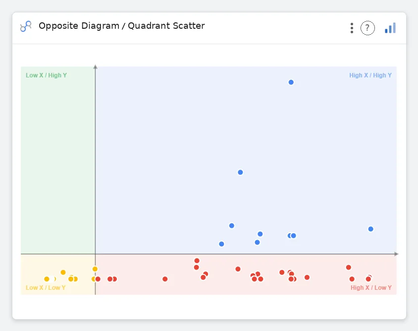
Opposite Diagram visualizes two opposing forces — pros vs cons, supports vs blocks, drivers vs detractors — as parallel rows of weighted bars. The strategic two-sider, ready for a slide.
What it does
Two parallel columns of bars, weighted, with center labels and per-side coloring.
Why use it
Decision frameworks live in tables; this chart turns them into a chart your audience can read.
Three ways teams use it
Strategy
Pros vs cons for a major decision.
UX
Usability strengths vs blockers.
M&A
Synergy vs risk for a target.
Add it in 30 seconds
- Open your Data Studio report and click Add a chart → Community visualizations → Explore more.
- Paste the Viz Studio manifest URL or pick this chart from the Viz Studio gallery card.
- Bind the dimensions and metrics in the data panel — done.
More from Networks, Flows & Relationships
Arc Diagram
Node-link arc diagram — relationships you can actually trace.
NETWORKS, FLOWS & RELATIONSHIPS→
Audience Overlap
Proportional circles for audience segments — overlaps you can see.
NETWORKS, FLOWS & RELATIONSHIPS→
Bipartite Graph
Two columns, every link explicit — A-to-B relationships made obvious.
NETWORKS, FLOWS & RELATIONSHIPS→
Chord Diagram
Circular chord ribbons — every pairwise flow, perfectly weighted.
NETWORKS, FLOWS & RELATIONSHIPS→