Bubble Map
Packed bubbles, sized by a metric: every category, no axis tax.
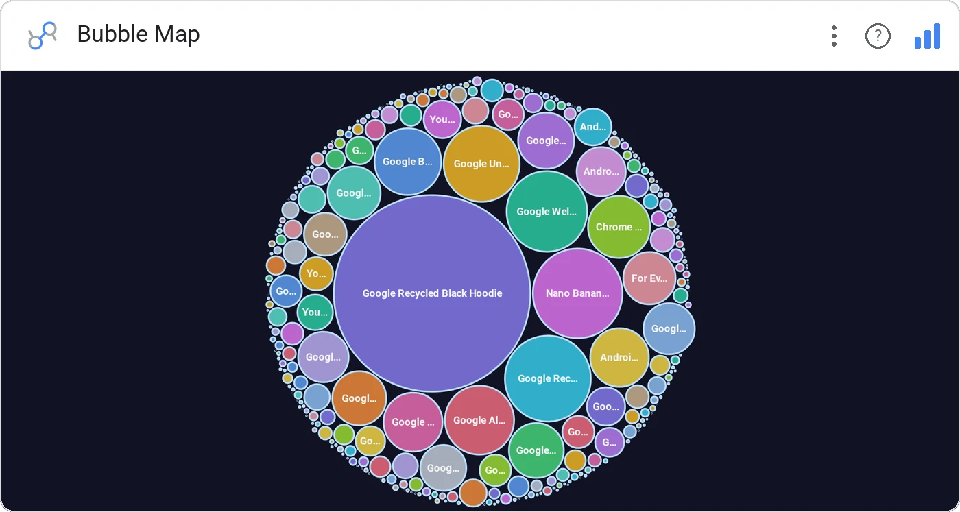
Bubble Map packs every category into a tight cluster of circles sized by your metric. With packed, force-directed, and grid layouts, plus gradient/single/series colors, it’s the catch-all for "show me everything, biggest to smallest."
Three layouts (packed, force, grid), three color modes (single, gradient, series), with inside/outside labels, tooltips, and click-to-cross-filter.
Bar charts run out of room past 30 categories. Bubble map keeps reading well at 200.
Three ways teams use it.
All campaigns by spend, biggest in the center.
SKUs by units sold across the catalog.
Headcount by team across the org.
Add it in 30 seconds.
Open your Data Studio report and click Add a chart → Community visualizations → Explore more.
Paste the Viz Studio manifest URL or pick this chart from the Viz Studio gallery card.
Bind the dimensions and metrics in the data panel. Done.
Included in your vizstudio plan.
One plan, everything in it: the full library of 75+ charts. No per-seat upcharges, no metering. Build a real dashboard before you pay a cent.
Start free →