Dual Donut
Two donuts side-by-side: current vs prior, plan vs actual, the comparison view.
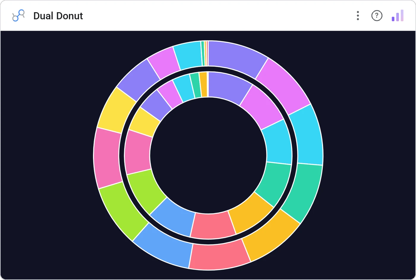
Dual Donut renders two same-scale donut charts in parallel, perfect for any "before vs after" split: current vs prior, plan vs actual, treatment vs control. Per-slice tooltips and a unified legend keep it readable.
Two donut charts in a row sharing a legend, with per-slice tooltips, total center labels, and cross-filtering.
A single donut shows composition; two donuts show how composition shifted, and that’s usually the story.
Three ways teams use it.
Revenue mix this year vs last.
Channel mix planned vs actual.
Headcount mix before vs after reorg.
Add it in 30 seconds.
Open your Data Studio report and click Add a chart → Community visualizations → Explore more.
Paste the Viz Studio manifest URL or pick this chart from the Viz Studio gallery card.
Bind the dimensions and metrics in the data panel. Done.
More from Pies, Donuts & Part-to-Whole
All 75+ charts →Nested donut rings: multiple metrics, same center, one composition.
Variable-radius nested donut: two metrics per slice, one chart.
Variable-radius pie: angle is share, radius is a second metric.
10×10 grid (every square is 1%), the part-to-whole everyone reads correctly.
Included in your vizstudio plan.
One plan, everything in it: the full library of 75+ charts. No per-seat upcharges, no metering. Build a real dashboard before you pay a cent.
Start free →