Simple Column Chart
A clean column chart: opinionated defaults, theme-aware.
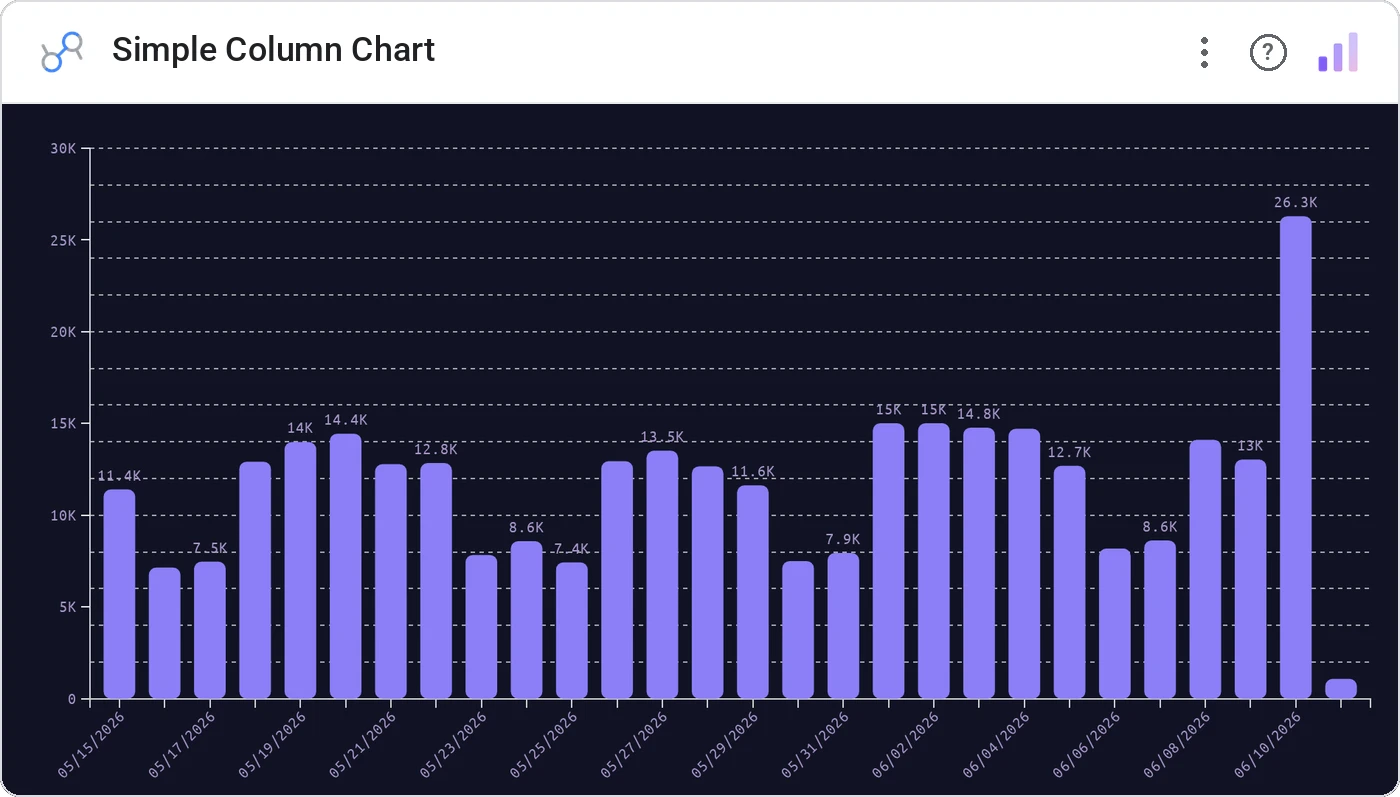
Simple Column Chart is the everyday bar chart, redone: opinionated spacing, theme-aware coloring, deliberate axis ticks, label-fit logic that handles dense categories automatically.
Single-series vertical bars with theme-aware colors, axis fit, tooltip, value labels, cross-filter.
Stock Data bar charts work, but they look it. This one is the same chart with the rough edges polished.
Three ways teams use it.
Daily revenue for the last 90 days.
Campaign clicks ranked.
Volume per warehouse.
Add it in 30 seconds.
Open your Data Studio report and click Add a chart → Community visualizations → Explore more.
Paste the Viz Studio manifest URL or pick this chart from the Viz Studio gallery card.
Bind the dimensions and metrics in the data panel. Done.
More from Bars, Columns & Ranking
All 75+ charts →CI bars for A/B variants: significance baked in.
The animated bar chart race that wins every monthly review.
Animated curved columns: bars that arc to draw the eye.
Curved columns, static, the still-frame version with the same elegance.
Included in your vizstudio plan.
One plan, everything in it: the full library of 75+ charts. No per-seat upcharges, no metering. Build a real dashboard before you pay a cent.
Start free →