Streamgraph
Stacked area, no fixed baseline: flowing composition over time.
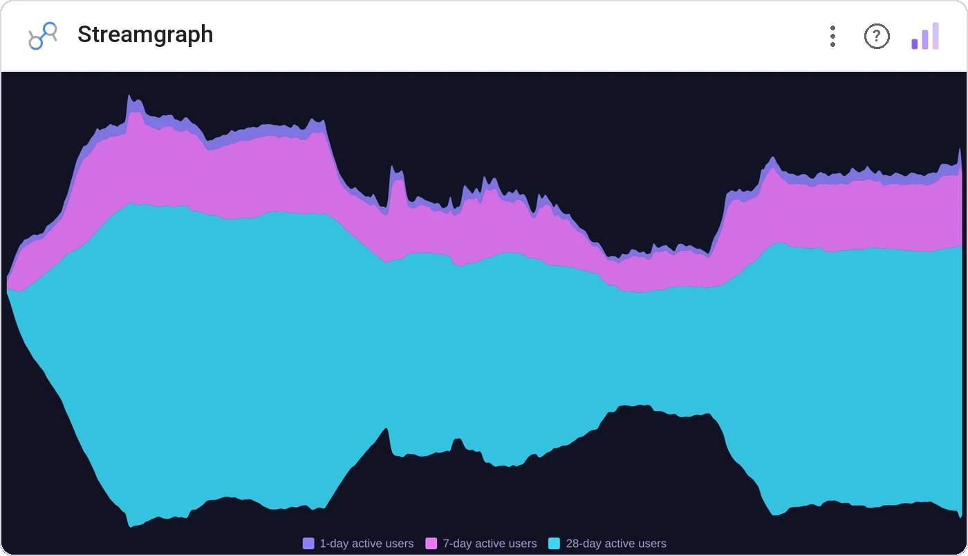
Streamgraph stacks series around a central baseline that floats, producing flowing shapes that emphasize change in composition rather than totals. The chart for music genre share, ad spend mix, and any narrative "how did the wave shift?"
Floating-baseline stacked area with smooth interpolation, per-category color, tooltip, and label leaders.
Best for showing how composition shifts when the absolute total isn’t the headline.
Three ways teams use it.
Channel share over years.
Topic share in a news corpus.
Genre share by decade.
Add it in 30 seconds.
Open your Data Studio report and click Add a chart → Community visualizations → Explore more.
Paste the Viz Studio manifest URL or pick this chart from the Viz Studio gallery card.
Bind the dimensions and metrics in the data panel. Done.
More from Time Series & Trends
All 75+ charts →Rank-over-time line chart: who's climbing, who's sliding.
Two metrics, two scales, one line of sight: without the lie factor.
Stacked area over time: composition and trend on the same canvas.
Same signed stacked bar, animated entrance + zoom controls.
Included in your vizstudio plan.
One plan, everything in it: the full library of 75+ charts. No per-seat upcharges, no metering. Build a real dashboard before you pay a cent.
Start free →