
Time Series with Annotations
Time series with annotated events: context where it actually happened.
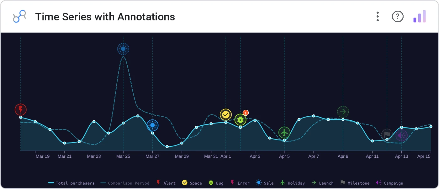
Time Series with Annotations is a clean multi-series line chart with one superpower: it marks real events directly on the timeline. Launches, campaigns, incidents, holidays - each one gets its own icon, color, and label, pinned to the exact date it happened. Annotations are first-class here, not a hack.
Plot up to five metrics over time, then layer event annotations on top from a second data source. Match events to one of 10 annotation types by keyword - each with its own icon and color from a library of 30 built-in icons (or any emoji) - and let viewers hover any marker for the full story. Tooltips, cross-filtering, and theme support included.
A spike without context is just a question mark. Was it the campaign? The outage? Black Friday? Annotations answer it right on the chart, so nobody has to dig through a changelog to explain the data.
30 icons, ready to go
Every annotation gets an icon, a color, and a label, pinned to the exact date it happened. Pick from 30 built-in icons — a cart for sales, a rocket for releases, a storm cloud for the day everything went sideways — or choose Custom and type any emoji.
Need something that isn't here? The 31st option is Custom: any emoji or short text becomes a marker.
Add icons to your chart
Icons are keyword-matched, so your data stays simple: a date, a label, and a one-word type. The chart does the rest.
- Bind your date and metrics as usual, then add an Annotation Label and an Annotation Type dimension from your events data.
- In the Style panel, set up to 10 annotation types. Each type gets a keyword (say, launch), an icon, and a color.
- Any event whose type matches a keyword shows up on the timeline with that icon. Hover for the full label.
Easy ways to link annotations
Annotations come from data, so there's nothing to redraw when plans change. Two setups our customers love:
Three ways teams use it.
DAU line with launch annotations.
Conversion line with campaign markers.
Latency with incident annotations.
Add it in 30 seconds.
Open your Data Studio report and click Add a chart → Community visualizations → Explore more.
Paste the Viz Studio manifest URL or pick this chart from the Viz Studio gallery card.
Bind the dimensions and metrics in the data panel. Done.
More from Time Series & Trends
All 75+ charts →
Rank-over-time line chart: who's climbing, who's sliding.
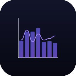
Two metrics, two scales, one line of sight: without the lie factor.
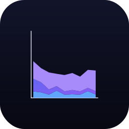
Stacked area over time: composition and trend on the same canvas.

Same signed stacked bar, animated entrance + zoom controls.
Included in your vizstudio plan.
One plan, everything in it: the full library of 75+ charts. No per-seat upcharges, no metering. Build a real dashboard before you pay a cent.
Start free →