What it is
2x2 Matrix plots your data on two axes and splits the canvas into four labeled quadrants — the shape every strategy framework already takes, from the Eisenhower box to BCG growth-share to value-vs-effort. It turns the whiteboard grid your team argues over into a live chart in Data Studio (formerly Looker Studio) that re-sorts itself the moment the numbers move.
What it does
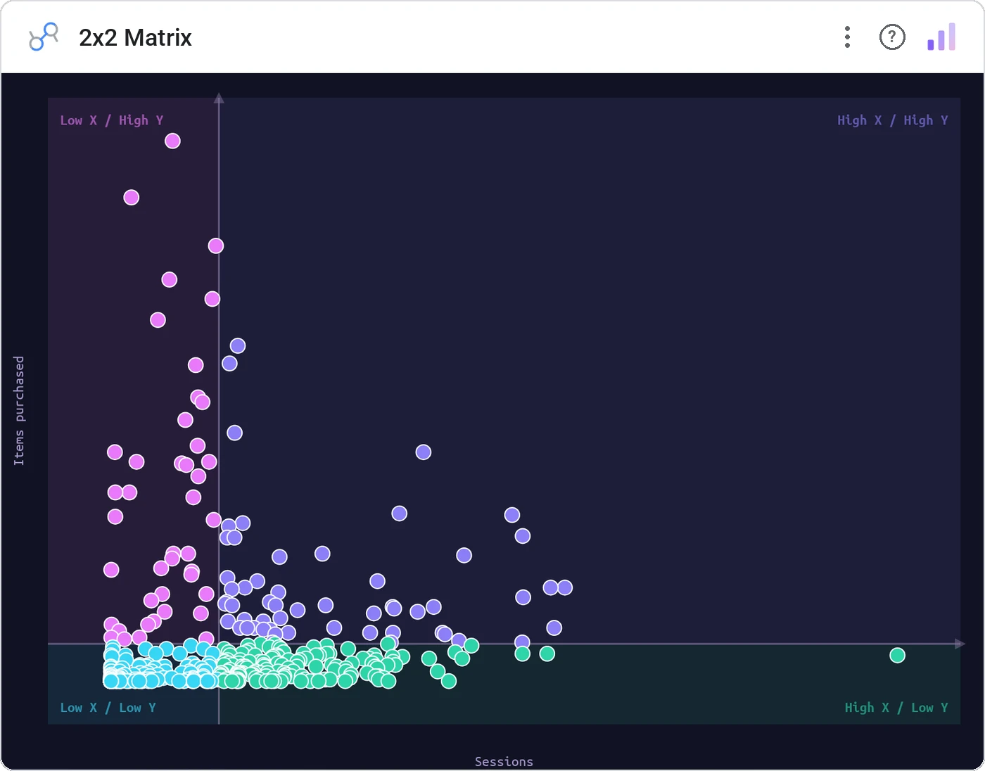
Plots each record by two metrics on an x/y plane, then drops configurable threshold lines that carve the space into four named, color-tinted quadrants. Add a third metric as bubble size, hover for detail, and click any point to cross-filter the rest of the page — all theme-aware.
Why use it
Strategy is quadrant-shaped: double down, quick win, deprioritize, drop. A 2x2 lays that decision grid over real data, so the call comes from where each point actually lands instead of a slide nobody refreshes.
Three ways teams use it
Add it in 30 seconds
- Open your Data Studio report and click Add a chart → Community visualizations → Explore more.
- Paste the Viz Studio manifest URL or pick this chart from the Viz Studio gallery card.
- Bind the dimensions and metrics in the data panel. Done.