Arc Diagram
Node-link arc diagram: relationships you can actually trace.
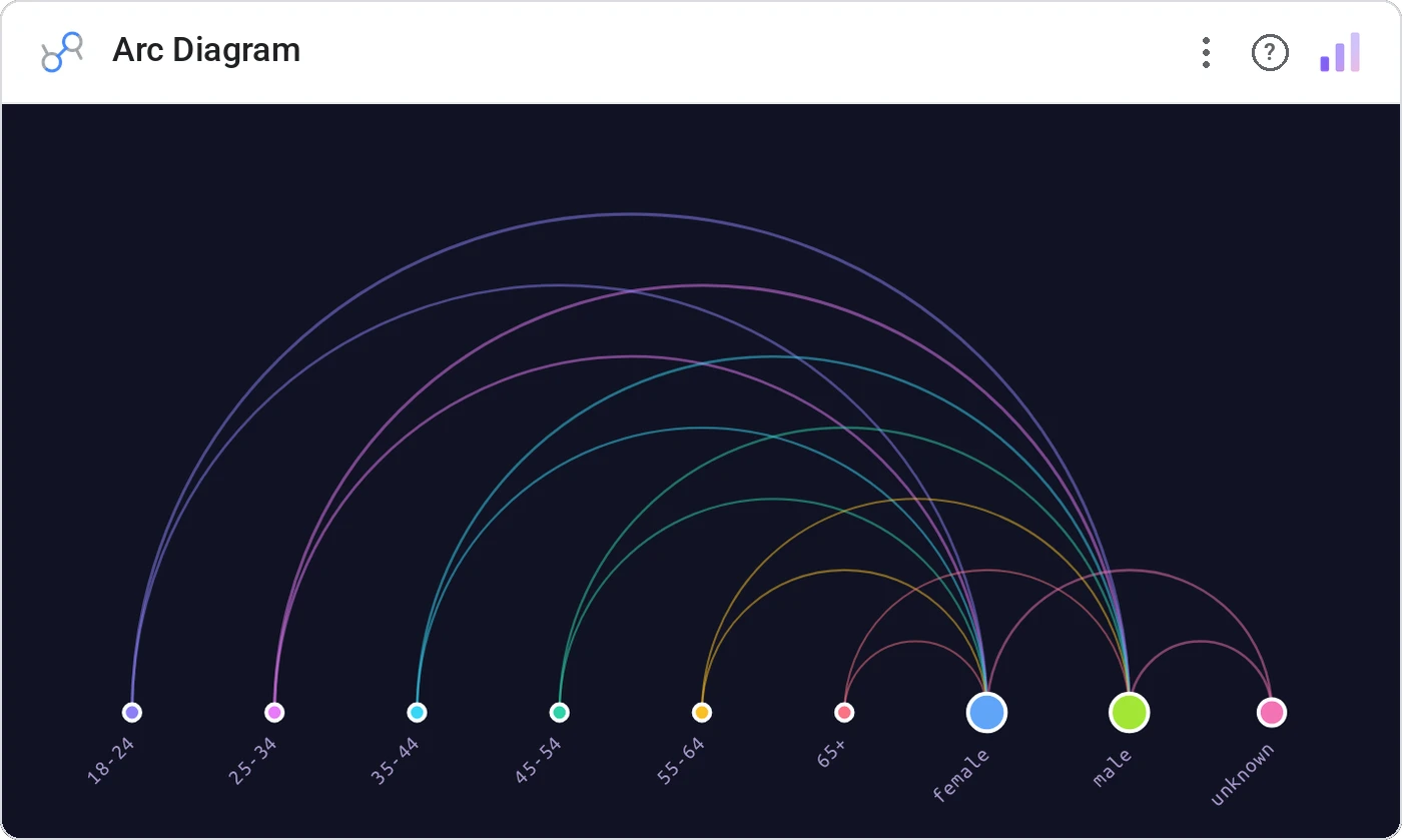
Arc Diagram lays nodes along a single axis and connects them with semi-circular arcs, with thickness encoding strength. It’s the cleanest way to show pairwise relationships when you don’t want a hairball.
Sorts nodes along a horizontal baseline, draws arcs above (and optionally below), scales nodes by degree, and supports source/target/single/gradient arc colors.
When force-directed graphs become noise, arcs let people read every connection in order. Hover to highlight a node's full ego network.
Three ways teams use it.
User-to-feature adoption with thick arcs showing the heaviest users.
Co-shipment pairs surfaced for SKUs that travel together.
Co-authorship graph for a journal issue.
Add it in 30 seconds.
Open your Data Studio report and click Add a chart → Community visualizations → Explore more.
Paste the Viz Studio manifest URL or pick this chart from the Viz Studio gallery card.
Bind the dimensions and metrics in the data panel. Done.
More from Networks, Flows & Relationships
All 75+ charts →Proportional circles for audience segments: overlaps you can see.
Two columns, every link explicit: A-to-B relationships made obvious.
Circular chord ribbons: every pairwise flow, perfectly weighted.
Entity rows with bezier arcs: pairwise strength, sorted.
Included in your vizstudio plan.
One plan, everything in it: the full library of 75+ charts. No per-seat upcharges, no metering. Build a real dashboard before you pay a cent.
Start free →