Audience Overlap
Proportional circles for audience segments: overlaps you can see.
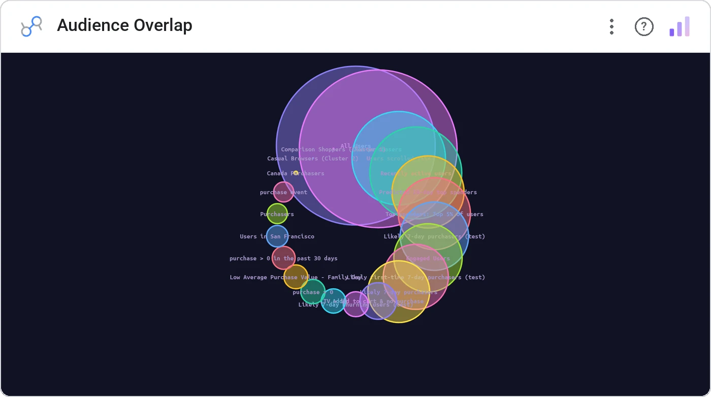
Audience Overlap draws each segment as a circle sized by population, then overlaps shared members so intersections are visible at a glance. Stop counting in spreadsheets: let the geometry do the work.
Renders sized circles per segment with overlap regions weighted by shared members; tooltips show counts and overlap %.
Reveals "too much overlap" segments before a campaign goes out, your CRM team’s favorite new chart.
Three ways teams use it.
Email list overlap before a multi-segment send.
Cohort intersection: Pro AND Mobile AND Daily users.
Lookalike audiences vs. existing customers.
Add it in 30 seconds.
Open your Data Studio report and click Add a chart → Community visualizations → Explore more.
Paste the Viz Studio manifest URL or pick this chart from the Viz Studio gallery card.
Bind the dimensions and metrics in the data panel. Done.
More from Networks, Flows & Relationships
All 75+ charts →Node-link arc diagram: relationships you can actually trace.
Two columns, every link explicit: A-to-B relationships made obvious.
Circular chord ribbons: every pairwise flow, perfectly weighted.
Entity rows with bezier arcs: pairwise strength, sorted.
Included in your vizstudio plan.
One plan, everything in it: the full library of 75+ charts. No per-seat upcharges, no metering. Build a real dashboard before you pay a cent.
Start free →