Mirror Bar Chart
Two series mirrored around a baseline: comparisons that read in one glance.
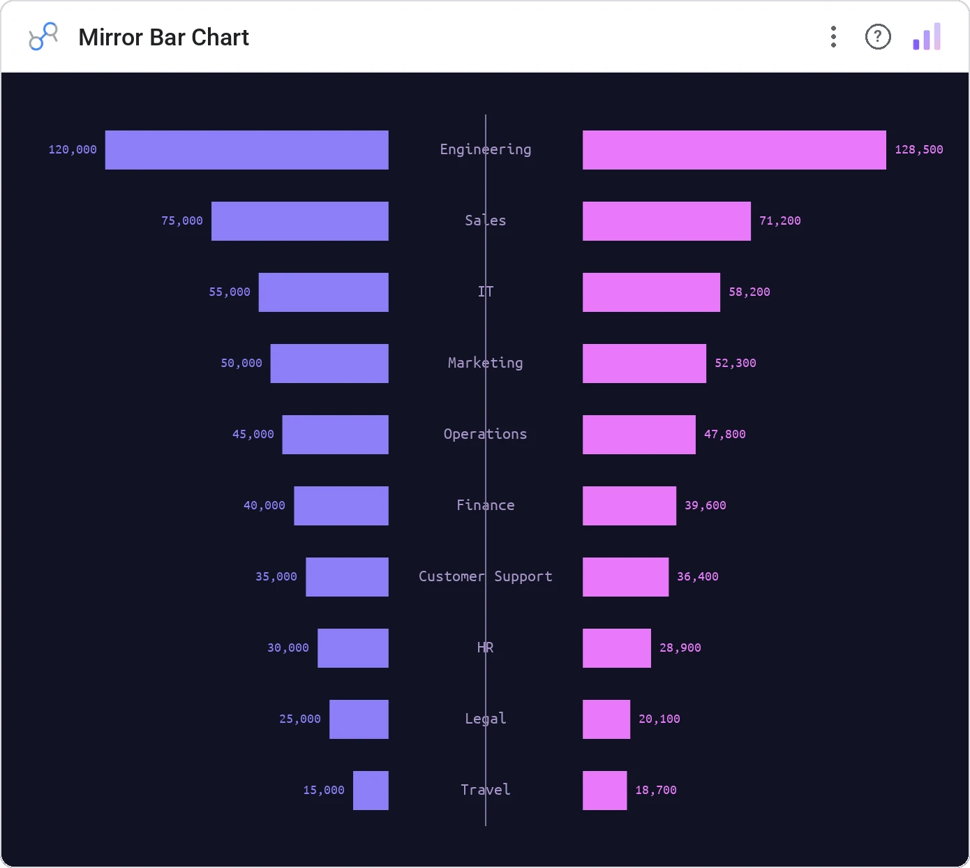
Mirror Bar Chart places one series above and one below a shared axis. Population pyramids, income vs expense, app A vs app B: anywhere two parallel series want a clean reflection.
Two-series mirrored bars around a shared central axis, with category labels in the middle and legend.
Side-by-side bars make the eye work harder. Mirroring makes the "who’s bigger?" question literal.
Three ways teams use it.
Population pyramid by age and gender.
Income above, expenses below per month.
Acquired vs lost customers per segment.
Add it in 30 seconds.
Open your Data Studio report and click Add a chart → Community visualizations → Explore more.
Paste the Viz Studio manifest URL or pick this chart from the Viz Studio gallery card.
Bind the dimensions and metrics in the data panel. Done.
More from Bars, Columns & Ranking
All 75+ charts →CI bars for A/B variants: significance baked in.
The animated bar chart race that wins every monthly review.
Animated curved columns: bars that arc to draw the eye.
Curved columns, static, the still-frame version with the same elegance.
Included in your vizstudio plan.
One plan, everything in it: the full library of 75+ charts. No per-seat upcharges, no metering. Build a real dashboard before you pay a cent.
Start free →