Q-Q Plot
Q-Q plot: does this distribution match the one you expect?
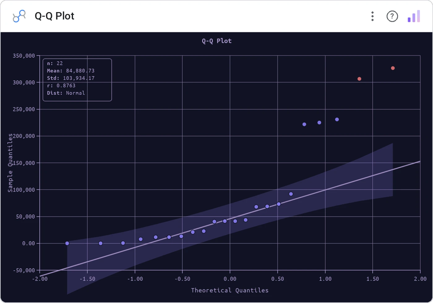
Q-Q Plot graphs the quantiles of your data against the quantiles of a reference distribution. A straight line means "yes, this is normal" (or whatever you compared against). Anything else is worth investigating.
Sample quantiles vs theoretical (normal by default) with reference line, optional band, and tooltip.
Histograms blur shape; a Q-Q plot says "normal or not" without a paragraph of stats.
Three ways teams use it.
Returns normality check.
Process output vs spec distribution.
Pre-test of model residuals.
Add it in 30 seconds.
Open your Data Studio report and click Add a chart → Community visualizations → Explore more.
Paste the Viz Studio manifest URL or pick this chart from the Viz Studio gallery card.
Bind the dimensions and metrics in the data panel. Done.
Included in your vizstudio plan.
One plan, everything in it: the full library of 75+ charts. No per-seat upcharges, no metering. Build a real dashboard before you pay a cent.
Start free →