Hexbin Density Plot
Hexagonal density plot: same hex grid, focused on point density.
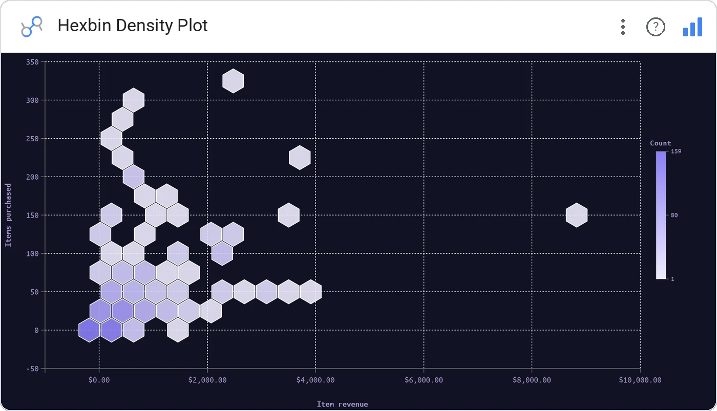
Hexbin Density Plot is the density-only cousin of Hexbin Scatter: pure point-density coloring, ideal when you don’t need an avg-X or avg-Y mode and just want the where-do-records-cluster picture.
Hex grid with density coloring across two metrics, configurable bin size and color scale.
When density alone is the answer, this is the leaner chart.
Three ways teams use it.
Where users cluster in a feature × tenure plane.
Trade size × hold-time density.
2D event density when projection isn’t needed.
Add it in 30 seconds.
Open your Data Studio report and click Add a chart → Community visualizations → Explore more.
Paste the Viz Studio manifest URL or pick this chart from the Viz Studio gallery card.
Bind the dimensions and metrics in the data panel. Done.
Included in your vizstudio plan.
One plan, everything in it: the full library of 75+ charts. No per-seat upcharges, no metering. Build a real dashboard before you pay a cent.
Start free →