Hexbin Scatter
Hexagonal density: scatter plots that survive 100k points.
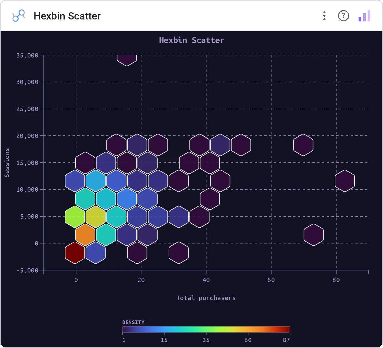
Hexbin Scatter bins two numeric metrics onto a pointy-top hexagon grid and shades each cell by density, average X, or average Y. Optional Category dimension surfaces top-3 categories in tooltips and joins cross-filters. 12 palettes, 4 density scales, optional trend line and marginals.
Hexagon bin grid over x/y metrics; density / avg-X / avg-Y color modes; 12 palettes, 4 scales (linear/sqrt/log/power); optional trend line; optional marginal distributions; min-count filter; click cross-filter.
Scatter overplots at scale. Hexbin keeps every region readable and surfaces hot zones immediately.
Three ways teams use it.
CTR × CPC density across thousands of keywords.
Session length × pages-viewed density.
Risk × return density across positions.
Add it in 30 seconds.
Open your Data Studio report and click Add a chart → Community visualizations → Explore more.
Paste the Viz Studio manifest URL or pick this chart from the Viz Studio gallery card.
Bind the dimensions and metrics in the data panel. Done.
More from Scatter, Correlation & Bubbles
All 75+ charts →
X × Y × size: three metrics, one chart, zero squinting.

A grid of bubbles: counts and magnitudes across two categorical axes.
Four-quadrant scatter, the strategy chart you've drawn on whiteboards.
Scatter with a fitted trend line: correlation without the chart-junk.
Included in your vizstudio plan.
One plan, everything in it: the full library of 75+ charts. No per-seat upcharges, no metering. Build a real dashboard before you pay a cent.
Start free →