KPI Sparkline Cards
Headline numbers with trend lines baked in, the executive scorecard, refined.
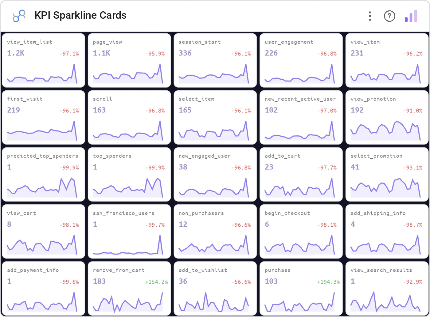
KPI Sparkline Cards combine a large headline metric, a delta vs. prior period, and an inline sparkline so leaders can see the number, the change, and the trajectory in a single glance.
Grid of KPI cards, each with primary metric, %-change indicator, and a 30/60/90-day sparkline.
Replaces three separate scorecards with one focused row. The sparkline kills the "but is that good?" follow-up.
Three ways teams use it.
MBR: Revenue, MRR, Churn %, NPS across the top.
DAU, WAU, activation, retention with mini-trends.
Spend, Leads, CPL, Conversion at a glance.
Add it in 30 seconds.
Open your Data Studio report and click Add a chart → Community visualizations → Explore more.
Paste the Viz Studio manifest URL or pick this chart from the Viz Studio gallery card.
Bind the dimensions and metrics in the data panel. Done.
More from KPI, Status & Goals
All 75+ charts →Donut + progress bars for category breakdowns, the dominant slice highlighted automatically.
Stephen Few's gauge replacement: actual, target, and ranges in one bar.
A row of donuts that each say "X% done": instantly readable.
Half-circle gauge: same story, half the real estate.
Included in your vizstudio plan.
One plan, everything in it: the full library of 75+ charts. No per-seat upcharges, no metering. Build a real dashboard before you pay a cent.
Start free →