
Solid Gauge
A radial gauge for any "X out of target" story: without speedometer kitsch.
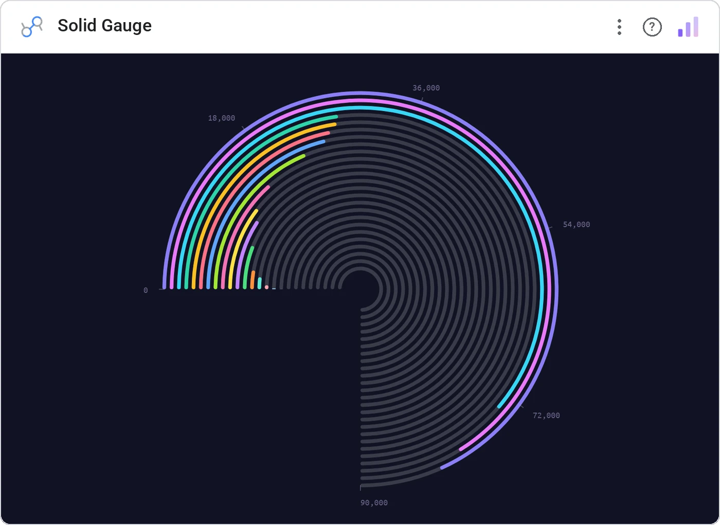
Solid Gauge fills a circular arc proportional to a metric’s progress toward a configurable target, with optional zones (red/amber/green) baked into the ring. Goal attainment, communicated cleanly.
270° or full-circle filled gauge with center value, %-to-target, and optional threshold bands.
Goal pages need a single hero number: this gives them one with built-in context.
Three ways teams use it.
Quota attainment: 78% of $4M.
% tickets resolved within SLA.
% of campaign goal.
Add it in 30 seconds.
Open your Data Studio report and click Add a chart → Community visualizations → Explore more.
Paste the Viz Studio manifest URL or pick this chart from the Viz Studio gallery card.
Bind the dimensions and metrics in the data panel. Done.
More from KPI, Status & Goals
All 75+ charts →
Donut + progress bars for category breakdowns, the dominant slice highlighted automatically.

Stephen Few's gauge replacement: actual, target, and ranges in one bar.
Headline numbers with trend lines baked in, the executive scorecard, refined.
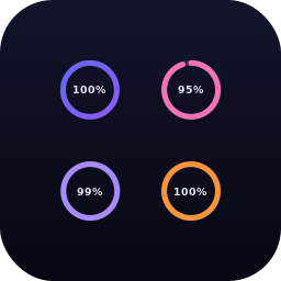
A row of donuts that each say "X% done": instantly readable.
Included in your vizstudio plan.
One plan, everything in it: the full library of 75+ charts. No per-seat upcharges, no metering. Build a real dashboard before you pay a cent.
Start free →